 31
comments
|
Saturday, June 14, 2008
31
comments
|
Saturday, June 14, 2008
So here is my blog freebie for Day 15. Like it? Download and leave a comment--here, there or anywhere. Personal use only and send friends here, please don't share the link (DWJSD):

And here is the download that will be available at Divine Digital tomorrow:
And don't miss the fab quickpages made by Rebbeca (kiden) for Father's Day. They are on her new blog and they are her first blog freebie!!!!! Click on the image to get to her blog and download.....

I just got done venting via vocabulary on that mean blog of the other day. The owner is thinking of changing the name to discourage trolls (what they call mean people who make anon comments) and I just had to speak my peace. Kill them with kindness? No, my style is kill them with mature responses using correct vocabulary and words that speak to the level of my intelligence. And of course using my name whilst I do it. So, it got me thinking that I really should go to my customers more and ask what you all want in a product, not just a grab bag. So here is the poll of the day:
1. Is grunge on the way out? Are people still looking for dirty, grunged up papers and elements?
2. What about glitter---have you had enough of it? Or bling?
3. Colors---traditional, retro, boy, girl---what do you want to see more of or what is now lacking in the scrap stores you visit that I should consider using in my designs?
4. Elements---buttons and bows, gumbands (yes, I'm from Pittsburgh), ribbon wraps, bottle caps, what else do you look for in elements? What do you want to see less of in kits? Do you like it when I make a frame or page tear that is embellished? Do you want more/less frames, ribbons, flowers, etc. Give it to me, let me know what elements you want and don't want me to put in my kits.
5. Texture---do I add too much, not enough? Are trends moving toward "clean" designs which mean less grunge and texture?
6. Commercial Use Overlays---abstract? cutsie? texture? What do you want more of that I do......
Okay, so please respond to the above six questions either here on my blog via a comment or by email to me, cyndi@divinedigital.com
I'm in a friendly mood so those who respond and give me honest, constructive feedback will get a little goodie from me. It might take me until Monday to get it to you since I am being called to the backyard as I type to referee yet another boys will be boys fight.....but I will get you a thank you goodie.
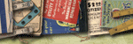
And, since the other day I had so much fun with the guessing photo game (yes, boys are still yelling, probably hitting each other in the backyard), I decided to throw another photo out there tonight. Obviously, this is a texture. What I want you to guess is what object did I photograph to get this texture? No email guesses as I can't keep up with all the emails I get now, let alone more guesses. Leave your guess via a comment here on my blog and if you are right make sure you come back and check out the list of winners when I post them on Monday. Then, if you are a winner, email me THEN and I will email you a $5 coupon for use in my store at Divine Digital. Sound good? Want to guess? The first ten correct guesses are the winners!!!!!!!!

Have a fantastic Father's Day if you are celebrating that holiday in your country and a peaceful rest of the weekend,
Cyndi


31 Comments:
Your photo texture looks woven...It could be a place mat, fabric, or basket.
5:50 PM
Love the blog freebie ... these greens are just so SOOOOO perfect! and I love the texture on that one LOL!
At least your sons are fighting outside. When my 2 sons would fight, I would tell them "Go outside. I don't want blood on my rug!" *snort* They never did kill each other. I did not know any other way to deal with it because I am an only child.
Is the mystery photo a hamper?
6:10 PM
I think the picture is a basket or placemat. Very nice texture.
6:14 PM
Questions:
1. I like grunge a lot especially for teenage boys or men since I have 2 teenage boys, I look for grunge a lot. It's fun and I don't think it's on the way out.
2. As I have a very princessy girl and am a girly girl too, I love glitter!!!!!
3. I think retro is good except yellows/greens unless paired with other colors. I like vintage too. But retro colors and shapes are needed.
4. I look for unique elements that I can't do or not artistic enough to make. I have my own blog and give away freebies and can do buttons/bows but some unique stuff (bottle caps, torn papers, and artistic like painted items....) I am not an artist so I like collecting the kits that have the look of being painted....
5. I LOVE YOUR TEXTURE. I think you do the right amount.
6. Ohhhh....I am a commerical use junkie since as stated in #4, I am not an artitst by any means so I look for CU items and have just discovered how great overlays are especially by mixing them. Keep on with those.
tw1717@gmail.com
http://thequeenandtheprincess.typepad.com/the_queen_and_the_princes/
Thank you for all you do.
6:20 PM
The picture looks like a basket to me or maybe a chair back.
1. Is grunge on the way out? I've never been very fond of grunge so can't say much about it.
2. What about glitter---I like glitter in small amounts for accents, but prefer more natural elements.
3. Colors---I use colors based on the photos I'm looking to scrap. If I find a kit that has the right elements and patterns I'll change colors if I need to. I use pretty much any natural tones or brighter colors and jewel tones. Your kits usually have color I really love.
4. Elements---I love frames! I'm really tired of only finding crumpled or folded ribbons. I prefer a nice straight ribbon. Bows are great. I really like unique shapes and elements.
5. Texture---I think you use just the right amount of texture.
6. Commercial Use Overlays---I love texture and abstract patterns that I can combine for new and unique effects.
6:30 PM
I think the picture is from a Placemat or a Purse.
1. I don't know if grunge is in or out, but it can be useful in scrappin' for boys and men!
2. I like gems and bling more than just glitter, but both are sometimes overdone. (not by you)
3.Primary colors, Boy themes that are good for 10year olds and teenagers, not just baby's, toddlers, and men.
4.I like more 3D looking objects, household items, nature items, bows and ribbons are good too.
(for girls)
5.More texture the better, I think if it's a solid color in most cases "clean" is flat & boring to me.
6.abstract? cutsie? texture? YES, all the overlays you do are awesome! Keep up the great work!
Thanks for asking your audiance (sorry I'm not a buying customer yet, but things are looking up! ;))
6:44 PM
The pic looks like a woven planter or placemat IMO.
As far as questions go...
1. Grunge...I think there will always be a market for grunge. Some never liked it, some always will. I personally like some, but not all. I wouldn't toss it to the curb, but might not do all of my kits in a grungle style.
2. Glitter's fun...i like glitter swirls/doodles, and glitter-edged alphas, etc. Never was a bling fan...couldn't ever figure out how to use it.
3. I love retro! But I also like vintage/heritage styles, and a host of others. I think you hit it right on with For Sam...awesome feel to that kit!
4. Elements are what usually make a kit for me. I can make my own papers (but am too lazy to do so), but am NOT an artist! I think that ribbon wraps are becoming old hat, and we all have tons of ribbons and bows. I like having them in a kit if they are different...but I don't think I ever want to see another Atomic Cupcake bow again LOL. Layered edges seem to be very popular, and I like clusters IF they are shadowed properly. Frames are a must...I don't like having to make them with papers, especially for a uniquely colored kit.
5. Texture is a must, and your papers are wonderful.
6. I like the variety of CU stuff you have now. I LOVE your patterened overlays, keep up the great job with them!
On the subject of 'that blog'...if the owner really wanted to change things, she could change the settings that would disallow anonymous comments. I'm proud of you and the integrity you've shown throughout all of this.
6:44 PM
I think that the picture looks like upholstry fabric on a chair or couch.
1. I love the grunge look. I have a toddler and there is just not enough of this sort of thing.
2. I really like rhinestones is some sort of swirl, etc. Not a lot out there.
3. Retro is so great but anything that has to do with boys. There is so much out there for little girls
4. I really like the bottle caps and things that are a little different from the norm. I am fairly new to this so anything is great for me right now.
5. You texture is just right
6. I love the overlays
7:18 PM
I'm guessing the texture is from a checkbook cover. Guess it's just the shape you cropped it.
1. Yeah, I'm pretty grunged out. I always wondered why designers kept making more grunge overlays. How different can they be?
2. I've never been thrilled with glitter but sometimes I'm attracted to the ones that really sparkle.
3. I like to see kits with maybe 5 complimenting colors. Not so fond of retro or loud colors though I can take it on occasion. I'm tired of vintage looking stuff too. I'd like to see something fresh but I've no idea what that would be for me.
4. It excites me to see a new element like a new type of push pin. Something new that holds things down. Here's an idea. Paper weights. That can be versatile: acrylic ones with a place for a picture on the underside, rock paper weights with engraved zen words. I'd love to see a nice set of string with a number of different loops that I could attach whatever I want. I have a few sets, but only maybe one or two looped ones in a set. Frames! I need fresh ideas for frames. I prefer photo borders rather than actual beveled frames. I've got plenty of wraps but frames that come lightly clustered with stuff (and most definately on layers so they some can be moved or removed. I'm currently on a mission for clustered frames for 2, 3, 4, 5, etc. pics clustered together but are all visible. Bows? I'm bowed out.
5. I like gentle overlays (butterflies, foliage), almost hidden in a fine linen or soft texture. I love scenic pictures turned into a soft linen. This seems to be my biggest interest currently.
6. Refer to #5 above.
I think you have a nitch with the new overlay designs you have. They aren't my cup of tea but I'm certainly sure many others like them. I most appreciate how you have your own style! Even if it isn't my cup of tea. And I'm so sorry you got nailed about your grab bag. There's just no need for nasty comments.
7:55 PM
It looks like woven upholstery fabric.
7:55 PM
Thanks for the freebie! I think that the photo is of a hamper or a basket.
I think that variety is always the secret to success as a designer. When we browse the galleries we are looking for something different or something that sparks an idea. My only recommendation to you is that you redo your preview style. I think that your work is better than it looks in the previews. Your kits are always great value for the money. I can't believe how many sales, coupons, and freebies you have. Thanks for it all!
8:19 PM
I think the picture looks like a wicker furniture piece.
8:28 PM
I think the photo looks like my linen purse, but really "enlarged".
As for your questions, I don't care for the grunge, but then I'm not doing a lot of teen boy pages right now. I prefer a cleaner look, but love the textures, it gives depth to the page.
Bling is good, especially when we can us as much or as little as we like. As for colors -- Vintage and Primary/Basic colors are my favorites. I can use the vintage for more subdued pages, and the primary/basic colors for grandkid pages.
Thanks for the freebies and all yoru great designs.
8:36 PM
Since I was a winner last time, I'll let someone else have the fun. But as to answers for your questions...
1. Grunge is GOOD! I don't think it's on the way out at all. I also appreciate grunged elements and frames to go along with papers.
2. Glitter is GREAT, when done properly. It's nice when not only is glitter offered on the edge of papers, or on elements, but also if a glitter overlay is offered - that can be recolored easily and used over anything.
3. Colors... I love everything except yellow, because I'm not a big fan. Right now I'm into either very bright colors or nearly no colors, but that might just be a summer thing.
4. Elements---fewer buttongs and bows, love unusual wraps and FRAMES! But what REALLY revs me up are the border clusters! Embellishment is excellent. And enough butterflies... too many butterflies flitting about. OH! And the ONE element I've only seen recently, and sparingly, are metal photo sticks. Also clips (binder-type clips) suspended from string or thin chains that you can "clip" to photos to hang from your LO.
5. Texture---IMHO, you can have "clean designs" and still have texture. If papers look flat, (not solid, just "flat",) I won't even download them as a freebie, much less buy them in a store. I love your textures and think you do a great job in that department!
6. Commercial Use Overlays---Hmmm... I've just barely started experimenting with CU Overlays, so I'm probably not a good judge in this department. But, personally, I would enjoy abstract/artistic over cutesy. Then again, it could be that I have 2 boys that are getting older and I'm past the "cutesy" stage.
9:41 PM
oh my. #4 should be fewer BUTTONS, not buttongs (which looks like buttthongs and is a REALLY bad, but funny, typo!)
Sorry!
9:42 PM
I think the picture is fabric like for a sofa, chair, etc.
1. I like the grunge look also aged.
2. Glitter works for me, but I'm not sure what bling is.
3. Color wise I tend toward pink, purple, blue... some naturals.
4. I don't know what a gumband is. I love the torn & stitching effects. Flowers, ribbons, buttons all work for me. I'm pretty flexible with my elements. Maybe some metal type things... mesh, snaps, etc.
5. Personally I love texture it helps give the page more of a 3D effect.
6. Overlays... textures definitely.
Zanne
9:50 PM
. Is grunge on the way out?
I've never been a grunge person, so it doesn't matter, but I just htink its personal taste. Some people do really well with it and others don't.
2. What about glitter---
I can never get too much glitter or bling, sorry - I just love it!
3. Colors---
I like all different colors but find myself drawn mostly to a variety of colors in a kit, and not a monochrome theme. If its bright I love several different brights, same with earthtones (I like them better in the fall/harvest time) I love pastels especially in spring. I guess I seem to go with seasons LOL
4. Elements---
lov elements, the more the better! Love embellished frames, I think they look lovely when the designer 'fancies' them up. I like flowers, bows, ribbons, brads, and a special element that fits the kit theme like birds, or butterflies, or footballs etc
5. Texture---I'm in limbo about this. My personal taste is a variety of some less textured and patterned papers as well as some with a lot...it allows me to use both in a layout without overwhelming with too many prints/textures in one layout.
6. Commercial Use Overlays---I'm not into designing too much except for some prizes for a forum I'm on. Mostly like brush looking overlays, or patterns.
Hope that is of some help, but again, its just one persons opinion!
11:03 PM
I'm thinking your couch? or a handbag...or maybe a hat?
Sending you a big long email on your questions....
11:04 PM
ok, lucky last maybe lucky again, I´m guessing a chair
11:24 PM
s like either cross stitch fabric or one of those afghans you weave with yarn through a mess background.
12:03 AM
Could also be design on Plastic Canvas.
Also Variety in all the various textures is what I look for in design when I look at objects.
12:07 AM
Looks to me like it's a close-up of a sofa cushion. In fact, it looks just like my sofa cushion!
I love what you do! I am very partial to overlays and textures right now. And I don't believe that anything should be "on the way out". My layouts depend a lot on the pics I am using. Sometimes I NEED grunge, bling, pastels, primary colors, heritage, boys, girls, baby, kids, teens, love, wedding, etc. I have ALL of the above subjects to scrap and I use it ALL!! Thanks again for your generosity!
2:14 AM
i think the photo is upolstery fabric on a couch or chair. as for your questions ...
1. i love grunge. on everything. girl stuff too. for me, it's another layer of texture and adds age and character.
2. i am not a glitter fan. i use a tiny bit here or there, but rarely. bling is not for me. i ocassionally use a jewel or two.
3. as for colors, i have my favorites, but i find that even colors i don't like can look great in the right kit. i have a little boy and a little girl. something always fits somewhere.
4. ellies are tough. i love unique ellies. i'm tired of the same old buttons, bows, and ribbons. i love interesting buttons. and theme type ellies like a spoon and bowl for a kitchen kit, a hammer and drill for a guy kit. i have no artistic ability so i really appreciate those who share theirs. i also love doodles for the same reason.
5. i love textures and your a great!
6. i'm just starting to think about making papers. i'd like to collect a variety of basic textures to achieve the looks i see in shops. also, as i mentioned, i love grunge, so i'd like some great grunge overlays.
thanks for all the goodies!
4:25 AM
I think that it is a picture of the fabric from a couch or chair. Thanks for all that you share with us.
10:33 AM
Thank you for the extras for Day 15 - love the cluster frames!!
I think your mystery texture was made from a wicker item (hamper, woven basket, piece of furniture or a placemat).
For your survey:
I do like grunge especially for outdoor/nature photos. But, I also like girly frills and a bit of glitter (have 3 little granddaughters).
I'm not too fond of retro.
For elements, I like unique ones and I love frames, especially fancy frames (wrapped, embellished or clusters).
I like clustered journaling tags - adds a quick finish to a page.
I like to see some straight ribbons in a kit, I find more ways to use them than the folded ribbons.
I like all your textured papers.
I don't buy CU items as I don't know how to use them.
11:31 AM
TY so very much for another AWESOME extra!!!!!!!!
12:00 PM
1. hate grunge but others just seem to go nuts over it
2. i like glitter in certain situations where it is appropriate
3. i really dislike certain colors such as browns/tans, burnt orange, etc. i like what i'd call "pretty" colors such as rose, moss green, lilac, cornflower blue, cranberry, etc. a real turnoff for me is a kit that is made of several shades of the same color, it all just runs together
4. i like classy looking elements, so tired of all the torn, dirty and cardboard stuff, i also like having individual pieces but also clustered versions of those pieces
5. you are doing great, keep it up
6. you're really good with these but why only overlays
two things to ponder
1. a lot of people use the kits to make cards or printables, etc. and for those people the elements can determine what they buy, i could love the papers but there aren't any elements that are useable
2. today's a perfect example, if you want to make something for father's day, getting a kit today is way too late. i had to make my own stuff to make dad's card
My guess on the picture is either a placemat, hat or a window shade.
Aunt Anne
3:33 PM
I think the picture is something like a camera bag or the fabric from a chair.
1. I personally like grunge, it gives more of a real look. Sometimes kits I see on the web look a little bit too cartoonish, the grungy adds a more real feel (in my opinion, anyway).
2. Personally, I've never really liked glitter that much, but I see it everywhere.
3. I'm pretty open to the color choices, I think it's more of the content of the kit (quality of the papers and elements). One thing I don't really care for is neon - it seems to be making a come back!
4. This is a hard call - I'm an overlay and photoshop brush junkie. Maybe some overlays, borders, tags, journaling pieces and frames.
5. I like texture. I think that a lack of texture makes it look too cartoony and less real.
6. AAHHH!!! MORE, MORE, MORE - I love overlays - I'd love to see more Victorian, ornate, even Hindi/Indian styled overlays. Also some more nature inspired pages like vines and leaves.
Thanks for asking for our input!
7:29 PM
This photo looks like part of an old suitcase.
I just love your blog and your designs. Please just stay true to you!
7:37 AM
Thanks!
9:37 AM
Cyndi, it reminds me of a fishing case my brother had when we were little. About that same texture.
As far as what you create, I hate it that so many designers follow trends instead of creating them. You have a wonderful imagination and I really appreciate that your creations are mainly out of the box.
1:26 PM
Post a Comment
<< Home